
Services · Custom brand identity design
A brand identity you can explain
A logo mark that performs the same on a pitch-side board, a shirt, and your website. Below you can see what we created; on the methodology page, you can read why it turned out that way.
You see the research first, then the proposal.
Case study · The Magic Bees
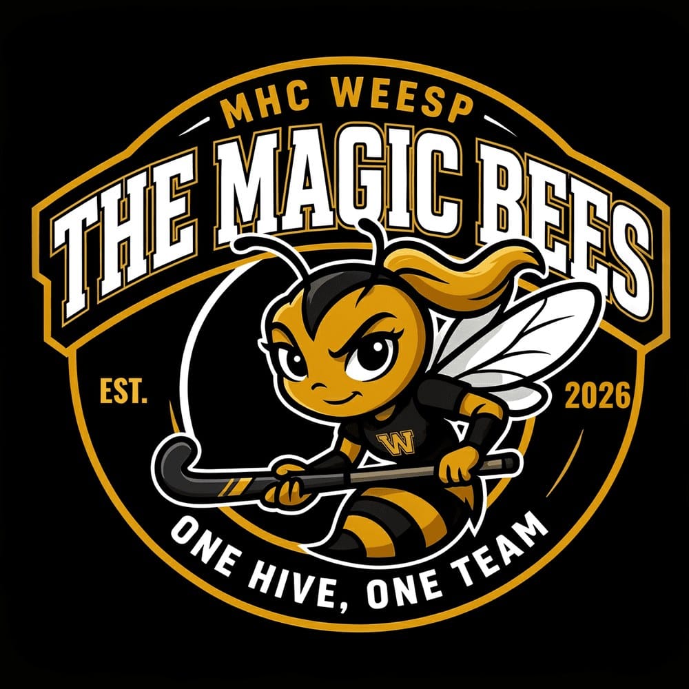
Designed for a three-meter billboard, a shirt, and a pennant. Readable on all three—tested in advance rather than just hoped for.
Real-world examples
What a finished brand identity looks like
No mood boards, but things that actually exist: a pitch-side board, a mat, a pennant, the first screen of a website. Click an image for the case study behind it.

The Magic Bees · MHC Weesp
Mascot for a new hockey team: the same bee on the shirt, the board, and the pennant.
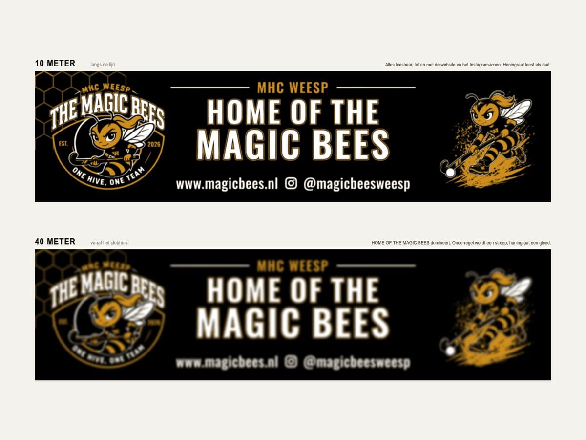
The Magic Bees · MHC Weesp
Billboard measuring 2.95 by 0.75 meters, pre-tested for readability at 10, 20, 40, and 80 meters.
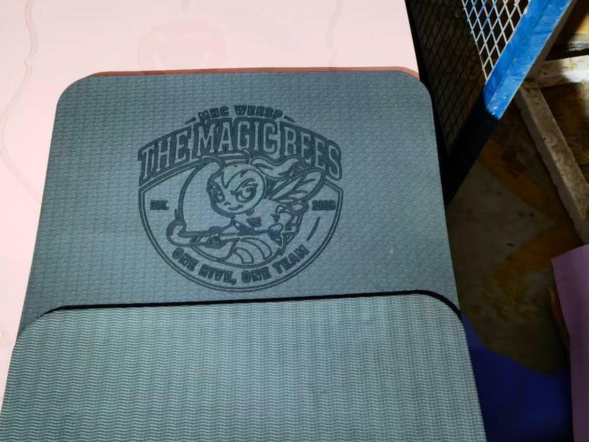
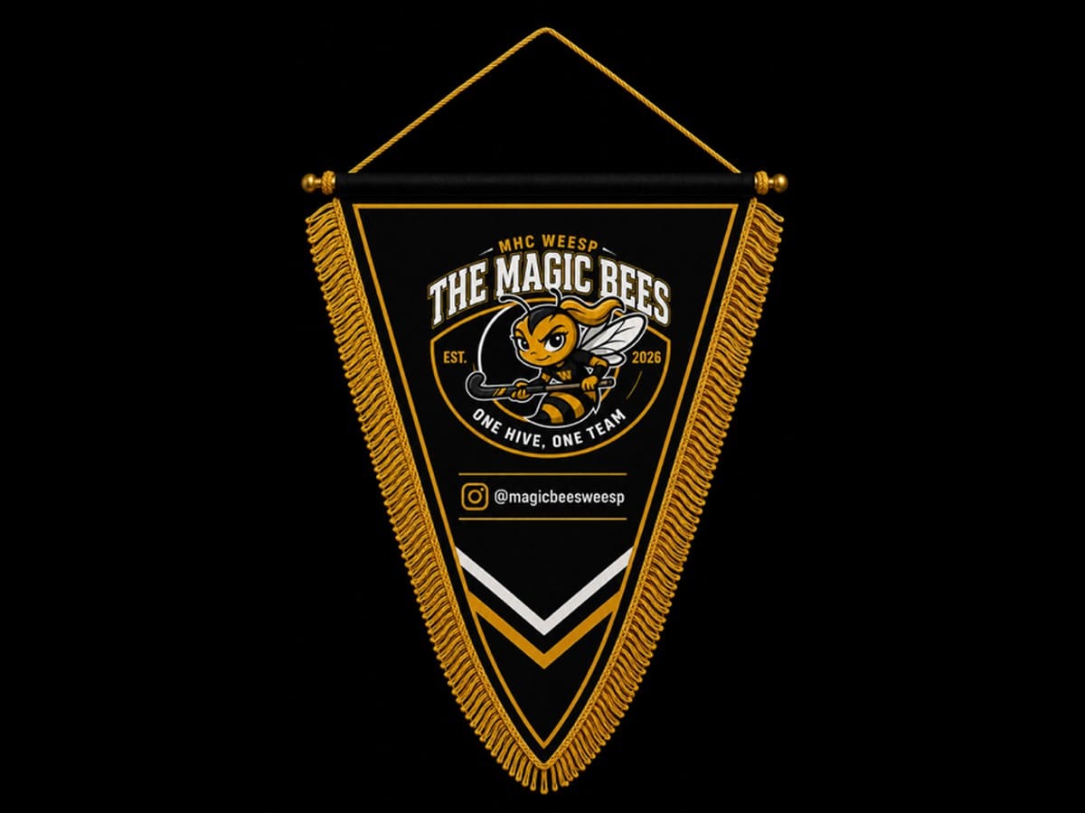
The Magic Bees · MHC Weesp
Club pennant with logo mark, tagline, and Instagram handle, in the same two colors as the board.
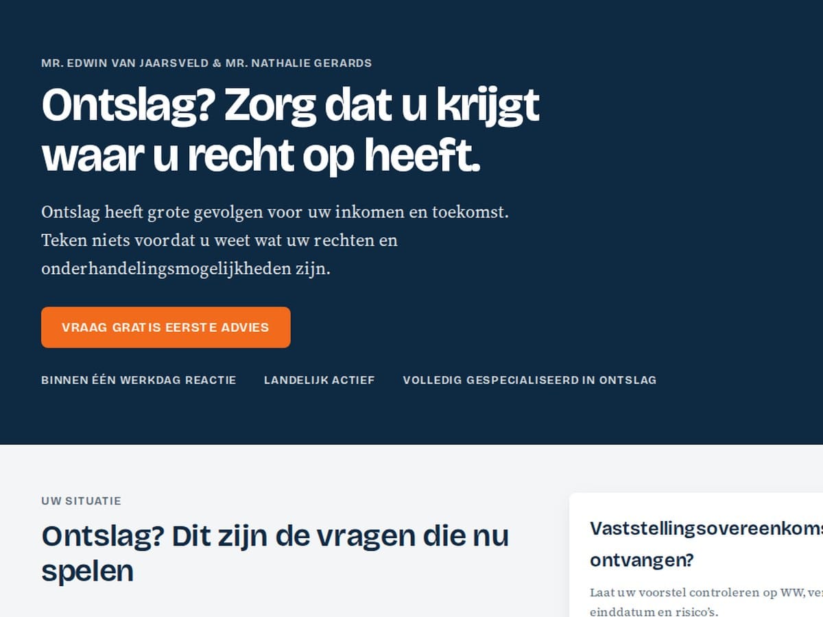
Ontslagspecialist
New brand identity for an employment law practice: dark blue, one signal colorAccent Color The striking color in a brand identity that draws attention, for example for buttons., a serif fontSerif Font A typeface featuring small decorative strokes at the ends of the letters, commonly seen in many newspapers. for body textBody font The font used for standard body text.. Shown here on the first screen of the new site, currently under construction.
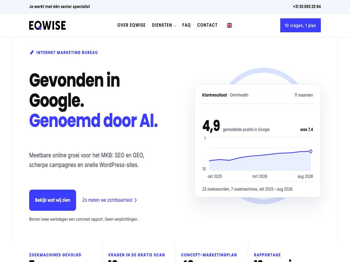
EQwise · this site
Our own brand identity: two font families, one brand blue, and measured contrastContrast How much a color differs from the background, and therefore how well something can be read., applied to the site you are viewing now.
Where it goes wrong
Why brand identities drift apart in practice
A brand identity almost always starts well. There is a logo, a color, and a font, and then the organization starts using them. A quoteCiting An AI assistant that uses your page as a source and typically includes a link to it., an advertisement, a new page: every application requires a choice not defined in the brand guidelines. That choice is then made on the spot by whoever is working on it at that moment.
After a few years, you can recognize this by three things.
- No one can explain why a color is that specific color anymore. As a result, every discussion is about personal taste instead of the function the color serves.
- The website, print materials, and presentations look like they belong to three different companies because they were set up by three different parties, each bringing their own assumptions.
- There is no benchmarkBenchmark A comparative figure, such as the average within your industry. to test against. Every deviation is therefore defensible, and the inconsistency grows every year.
This isn’t a taste problem; it’s a systems problem. That is why a brand identity with us starts with research and ends with a set of rules you can refer back to.
The approach
What we research before we design anything
Four consecutive research phases. Each delivers a foundation for the next step. We also document what is rejected and why, so choices aren’t debated again later.
01
Target audience and decision-making behavior
Who is looking, what is their question, and what do they need to see to feel confident taking the next step. We work with personasPersona A detailed description of a typical customer, including their needs, questions, and concerns., including the specific doubts that cause someone to drop off.
02
Desired brand perception
What impressionImpressions The number of times your site was displayed in search results. should the brand make on each of those personas: how much authorityAuthority How much trust search engines and AI have in your website., how much accessibility, how much differentiation. This is the yardstick against which everything else is measured.
03
Color and typographyTypography The selection and formatting of letters: which typeface, what size, and how much spacing.
We compare multiple directions and evaluate them against that yardstick. Contrast is measured, not estimated. What is rejected is rejected based on clear arguments.
04
Application and testing
A direction that works on a mood board might fail on a form. We apply it to real screens, such as buttons, tables, and error messages, before finalizing anything.
The evidence
A close-up look at that research
We have fully documented one project: from personas to desired brand perception, from brand perception to color and font directions. And from there to a system live on a real site. Including the directions that didn’t make the cut.
- From persona to brand perception, in a matrix you can verify yourself
- Color roles and measured contrast, instead of color psychology
- Headlines and body text researched separately, as they serve different purposes
- The same system applied to a real website, on desktop and mobile
An in-depth page. No sign-up required.
The delivery
What you receive
Not a mood board, but a working system you can hand over to a designer, a printer, or your web developer.
- A color palette where every color has a task, including measured contrast values
- A typographic scale for headlines, body text, and interface, in two font families with fixed weights
- Rules for buttons, cards, forms, lists, and whitespace, including often-forgotten states: hover, focus, error
- Design tokens, so the website, presentations, and print materials all pull from the same source
- A document explaining the reasoning behind every choice and what was rejected
That last part is what makes the difference when you need to defend choices internally. Or when someone else builds on it two years from now.
Are we building your website too? Then this is the starting point: the developer receives the rules instead of inventing them along the way. It can also be done standalone. A brand identity applies just as much to your quotes, your print work, and a site managed by someone else.
If something already exists
Already have a brand identity? Then we measure it first.
We start by auditing rather than rebuilding. We document what exists, where it drifts apart, and what is valuable. Often, parts of it are correct, and it’s mainly the surrounding rules that are missing.
You then receive an assessment of what can stay, what needs attention, and what must be replaced. We explicitly state what is NOT necessary—even if the conclusion is that most of it is usable.
Pre-project questions
Frequently asked questions about brand identity design
Does my website need a redesign for this?
Not necessarily. A brand identity defines how color, typographyTypography The selection and formatting of letters: which typeface, what size, and how much spacing., and space should function. Whether your current site can handle that is a separate question we investigate first. Sometimes applying the rules is enough; sometimes it isn’t. You will know the answer before anything is built.
How long does it take?
Expect four to six weeks, from the initial consultation to a finalized design systemDesign System A collection of fixed rules and components used to ensure everything is created in a consistent style.. What determines the leadLead Someone who has shown interest and left their contact details, for example via a form or a phone call. time is rarely the design: it is the two moments where you make a choice.
How much does a brand identity cost?
There are three packages, all amounts excluding VAT. Start €1,250 to €1,750 (one to two weeks), Plus €2,750 to €3,500 (two to three weeks) and custom from €5,000 (four to six weeks).
Start and Plus have a fixed scope with two rounds of revisions. For a custom brand identity, the requirements make the difference: digital only or including print, a single logo mark or a set of variants, with or without a mascot or illustration. For these projects, you will receive a fixed-price proposal following the introductory meeting.
How much of my time will this take?
We return with fully developed directions, not a questionnaire. You simply review what is already there and make a choice. What we need from you is your customer knowledge and your judgment at the moments when there is a real decision to be made.
Why don’t you choose a color that fits the industry?
Because a color carries no meaning on its own. How it is perceived depends on saturation, contrastContrast How much a color differs from the background, and therefore how well something can be read., the size of the surface, and how often it recurs. It also depends on the typographyTypography The selection and formatting of letters: which typeface, what size, and how much spacing. and the surrounding space. The same shade of blue can look professional or cheap, depending on that context. We therefore always evaluate the combination and never the color in isolation.
Hourly rates
| Format | Rate |
|---|---|
| Single hour, no commitment | €125 |
| 20-hour prepaid pack, paid upfront | €115 |
| From 50 hours per year | €110 |
| Fixed monthly contract, from 8 hours per month | €100 |
A brand identity is available in three fixed-price packages: Start (€1,250 to €1,750), Plus (€2,750 to €3,500), and Custom (from €5,000). What is included in each package can be found on the rates page. Additional correction rounds are billed at the hourly rate above.
All amounts exclude VAT.
The first step
First, let’s research what your brand needs to achieve
A single conversation where we review what you have now, who your customers are, and where things are falling apart. After that, you’ll know what is needed and whether we are the right partner for you.
